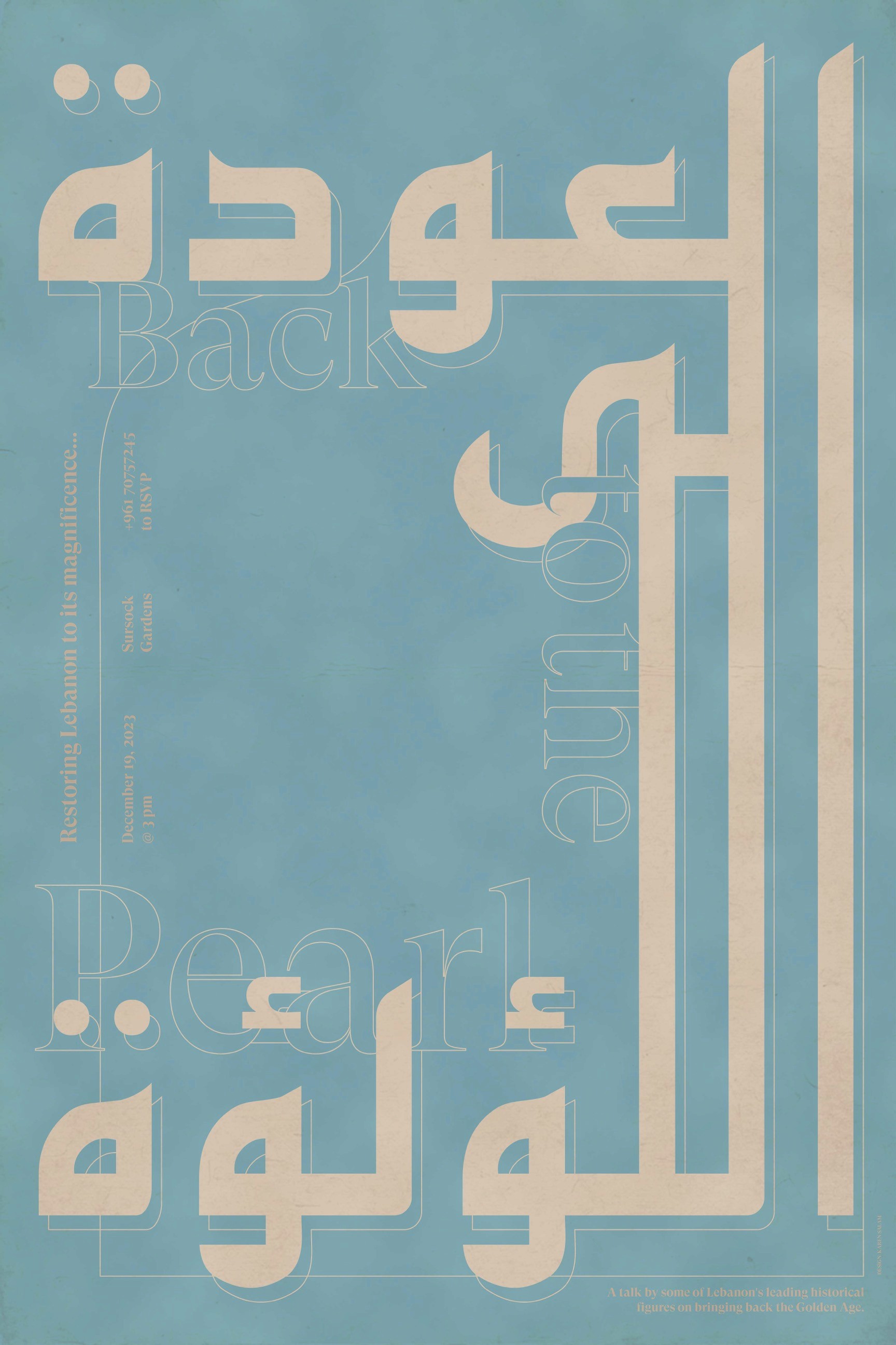
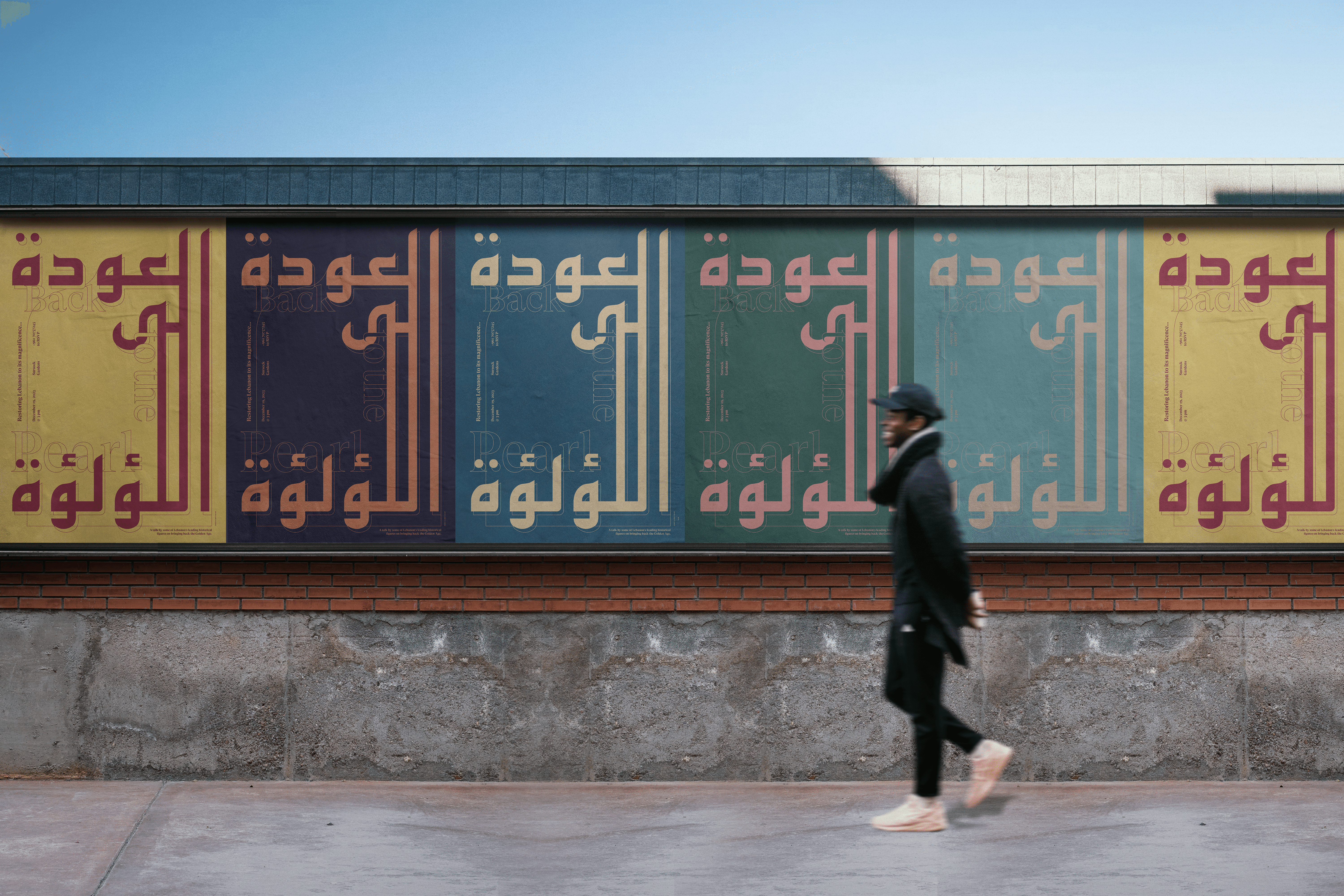
BACK TO THE PEARL

About:

Back to the Pearl is a conceptual poster series for a hypothetical conference in Lebanon, centered on the restoration of traditional architecture damaged in the August 4th blast. The project reflects on Lebanon’s cultural heritage, with a focus on reclaiming the country’s so-called Golden Age through preservation and collective memory.


The design avoids literal representation, instead using abstract linework that echoes the structural rhythm of Beirut’s historic buildings. The composition is unified by a subtle arch—a nod to one of the most recognizable elements in traditional Lebanese architecture, often seen in old window frames and facades.


The color variations are inspired by tones found throughout Lebanon, especially in the aging plaster, sun-worn stone, painted shutters, and oxidized metals of old Beirut. Together, the forms and colors create a system that feels both fragile and resilient—an homage to what was lost, and a quiet call to rebuild.

Challenge

For this project, I wanted to reference the rich architectural heritage of Lebanon without relying on literal imagery. The goal was to capture the feeling of place and history purely through type and graphic elements, while keeping the design clean, structured, and contemporary.

Solution

I chose a highly structured, angular Arabic typeface and paired it with a matching English typeface that shares similar sharp curves and ligatures. This pairing created a cohesive visual rhythm, while subtle architectural references came through in the details: extending Arabic letterforms downward to suggest columns, framing the piece with a thin guiding line, and curving that frame into an arched window at the top — a nod to one of the most iconic features of traditional Lebanese homes. Color choices were drawn from the local architecture, further grounding the design in place.

Poster Series