Services Provided
Adapting a well-established brand like Jenki meant working within an existing identity while introducing it to a new market. The goal was to maintain Jenki's bold tone and visual energy, but make it feel locally relevant for a Middle Eastern audience—specifically Lebanon. A major challenge was incorporating Arabic without fully rebranding: most Lebanese brands lean heavily on English, so I had to strike a balance. Another key point was preserving the lightning bolt in the "K," a defining feature of the original wordmark, across both scripts.
I translated the logotype into Arabic, carefully matching the rhythm and geometry of the original, and integrated the lightning bolt into the Arabic "ك" (K) to retain brand consistency. Rather than fully switching to Arabic, I used it selectively—mainly in the logo—while keeping collateral, subheadings, and packaging in English. This bilingual approach reflects local norms and gives the brand a unique, eye-catching twist. I also built out new collateral—matcha pouches, café elements, and social media—designed to feel culturally attuned while staying true to Jenki's core identity.
Translating the brand's energy through custom typography. The Arabic logotype was meticulously crafted to mirror the heavy, playful geometry of the English wordmark, seamlessly integrating Jenki's signature lightning bolt into the new letterforms to maintain cross-cultural brand recognition.
Retaining the brand's signature Electric Green was essential for instant recognition. Paired with a grounding Stone Leaf and a crisp Zest Blue, the localized palette preserves Jenki's vibrant, high-energy spirit across all new market touchpoints.
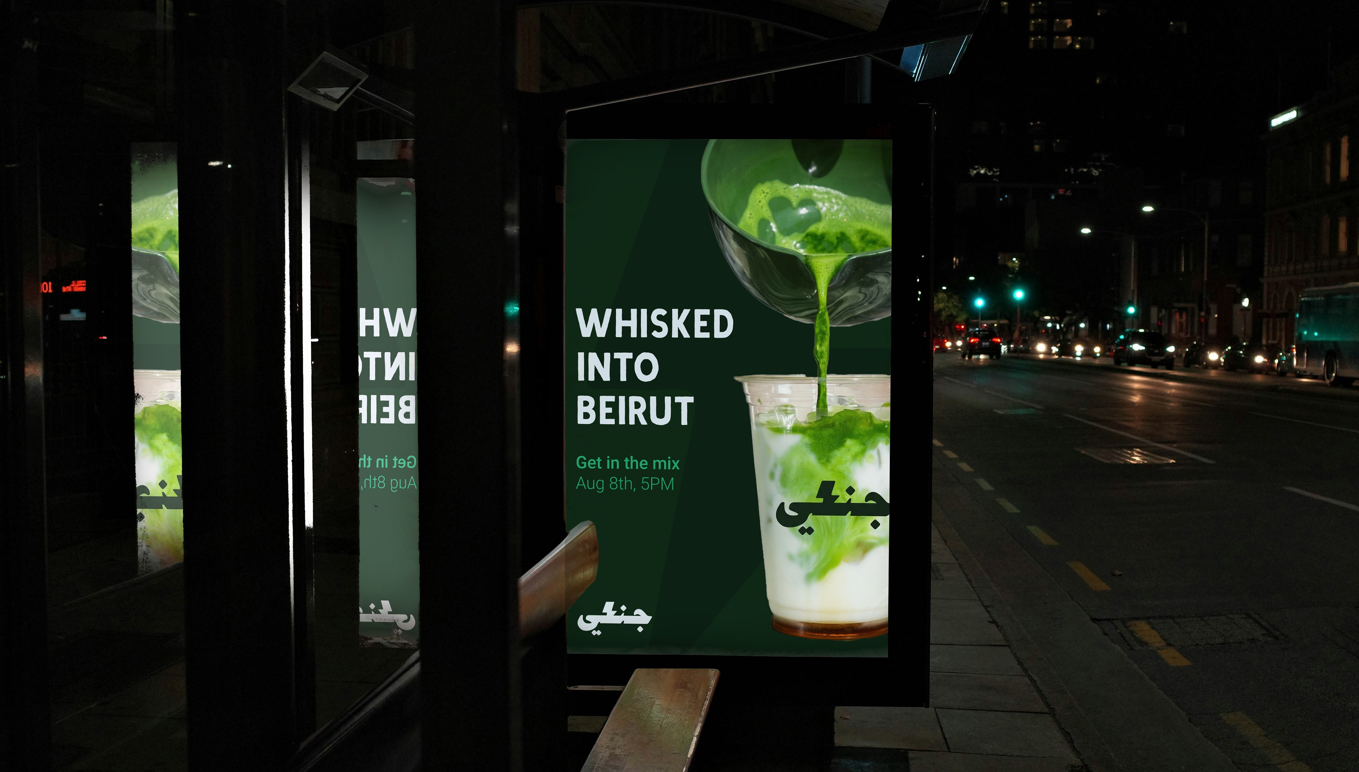
A high-contrast OOH announcement for the Beirut launch. The striking visuals and localized typography introduce Jenki's vibrant energy directly to the local streetscape.
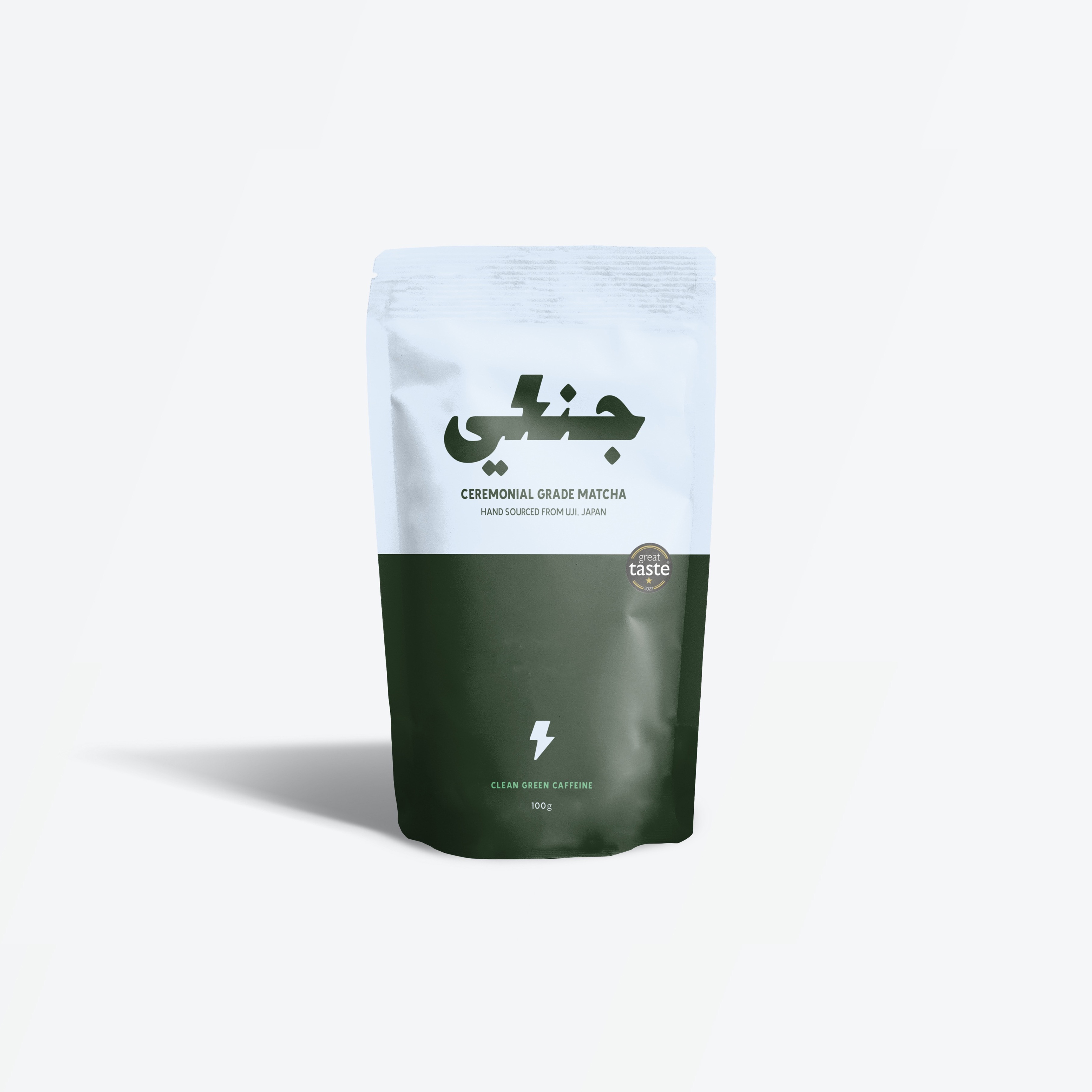
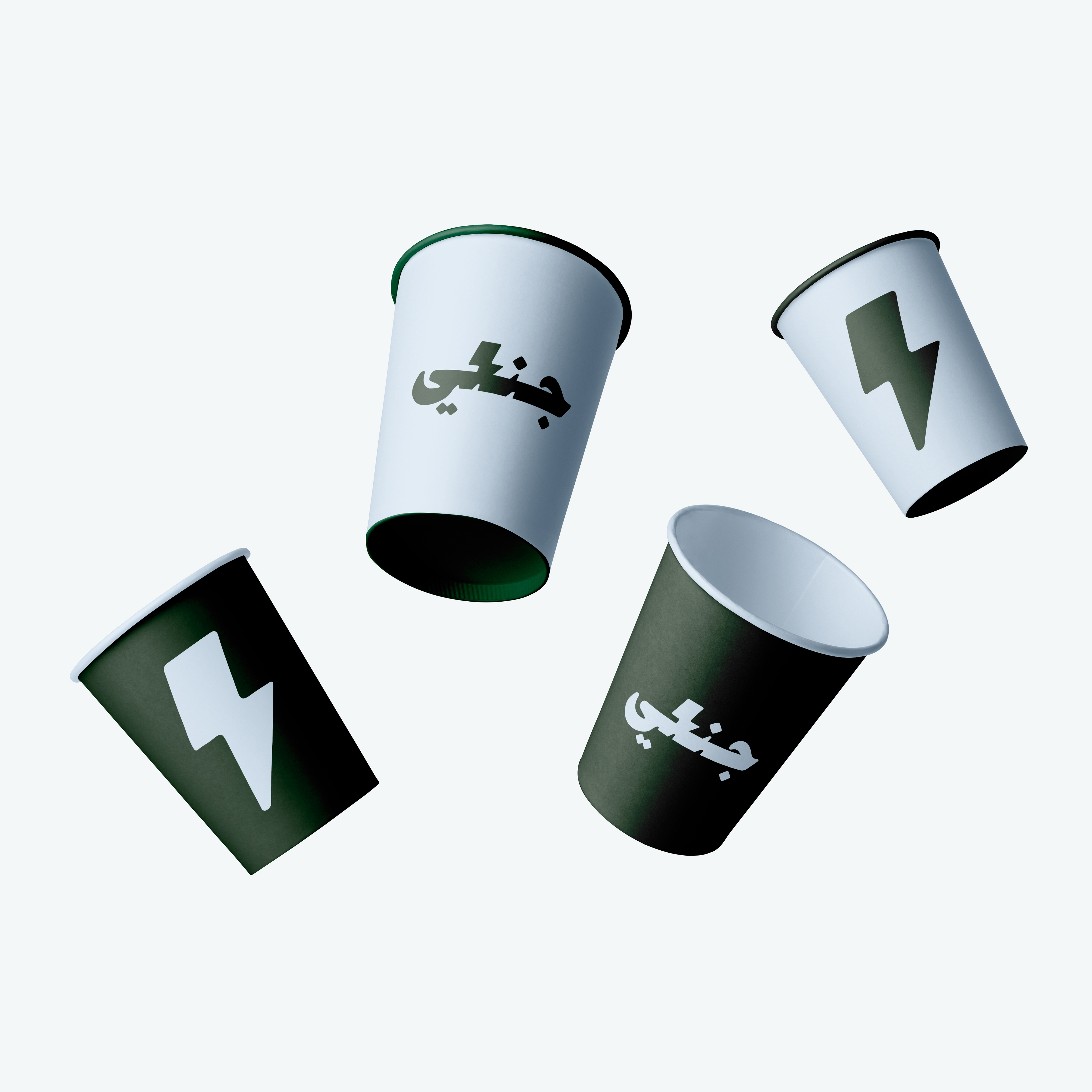
The localized Arabic wordmark and iconic lightning bolt applied across Jenki's physical products. The matcha pouch incorporates a bi-lingual layout to bridge the brand's global identity with Lebanon's bi-lingual culture, maintaining strict cross-cultural consistency from pouch to cup.
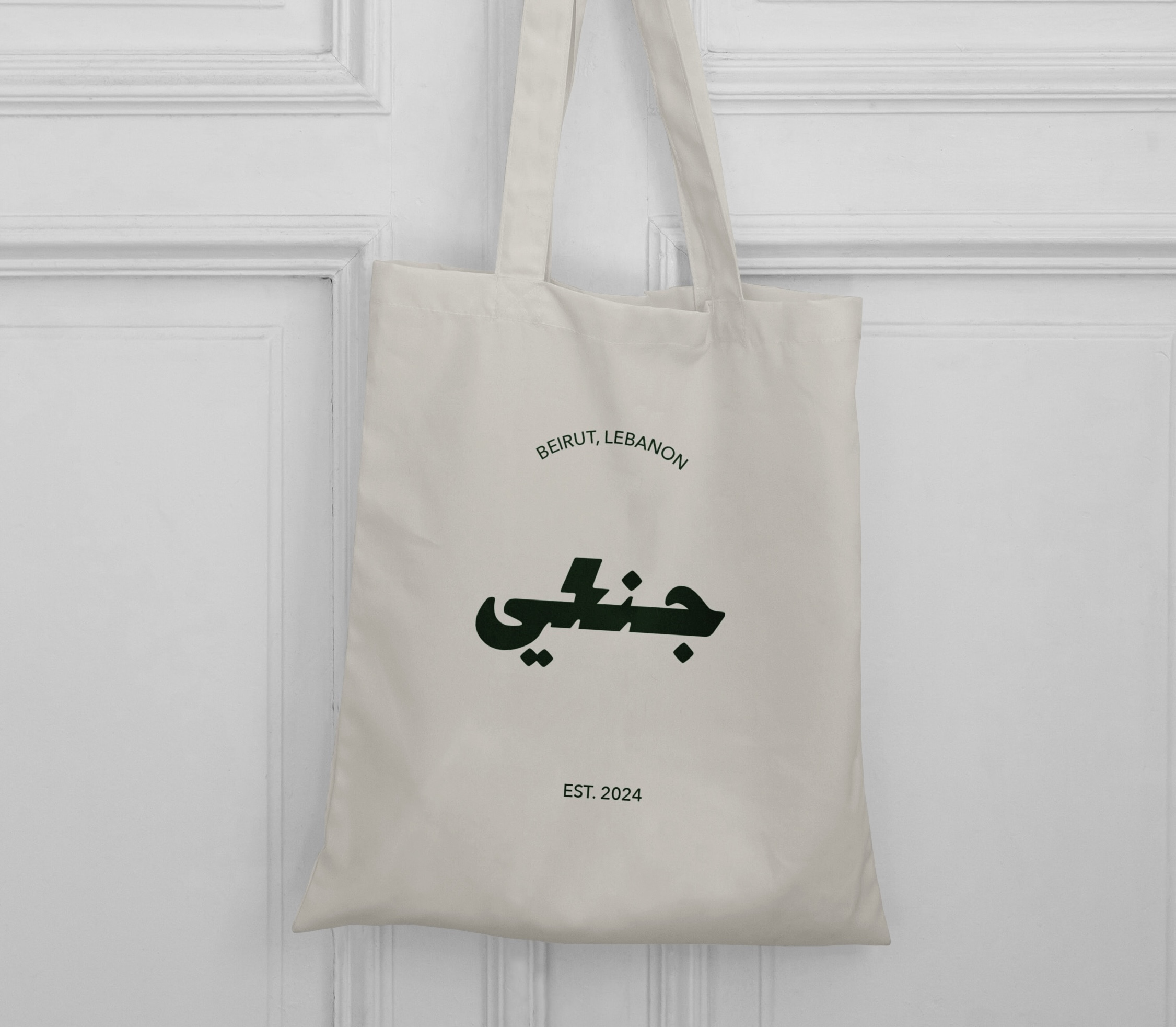
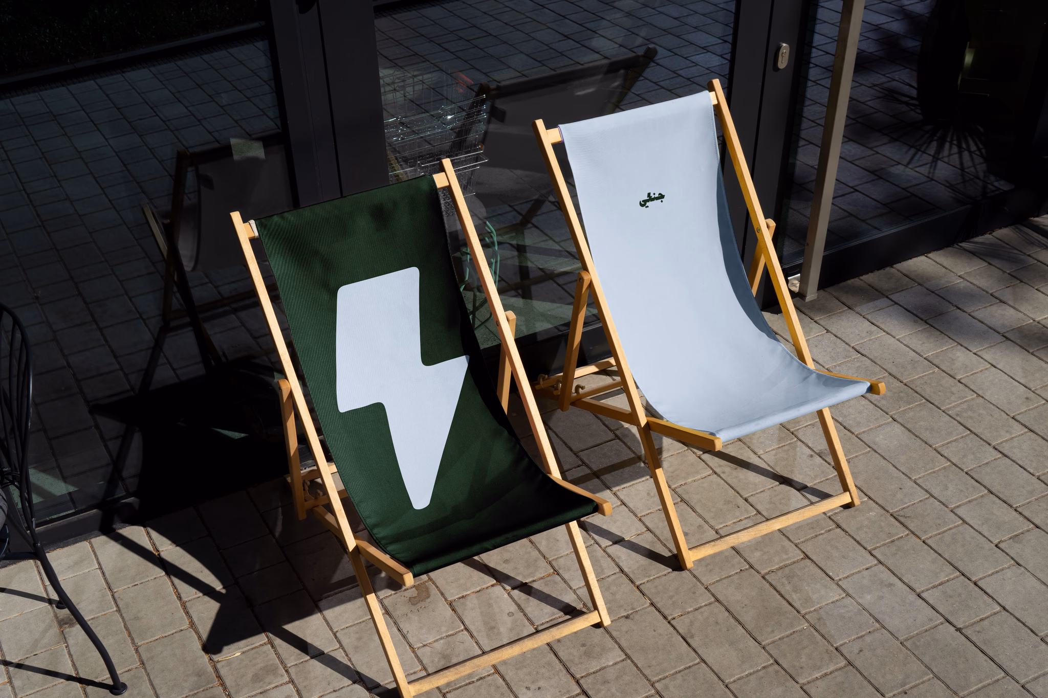
Beyond the product itself, the localized canvas tote and custom outdoor seating translate the brand's bold identity into tangible lifestyle touchpoints, creating an immersive, community-driven experience for the Beirut market.