

LOUIS D. BROWN PEACE INSTITUTE
Client:
Louis D. Brown Peace Institute
About:
The Louis D. Brown Peace Institute serves as a center of healing, teaching, and learning for families and communities impacted by murder, trauma, grief, and loss.
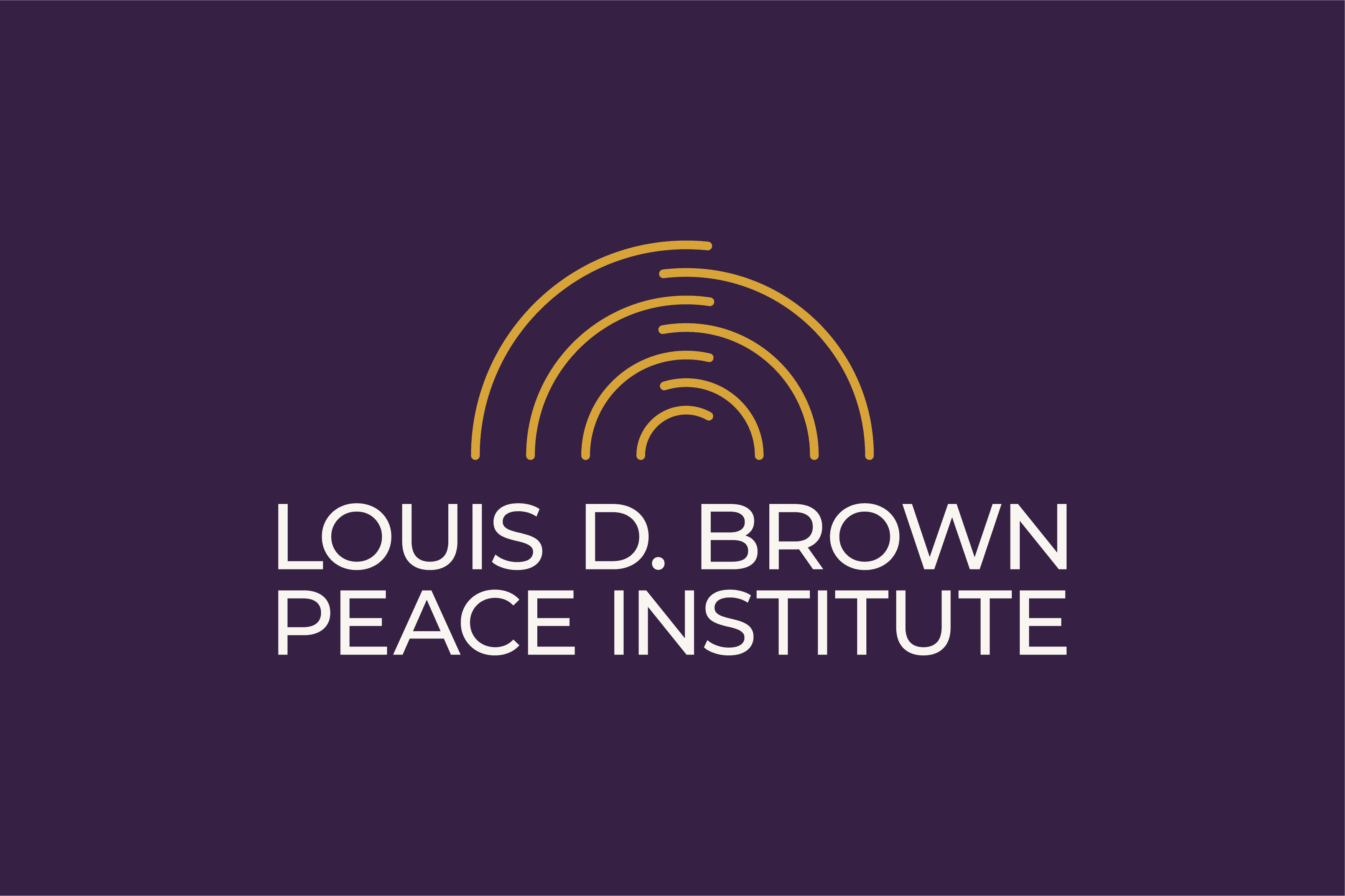
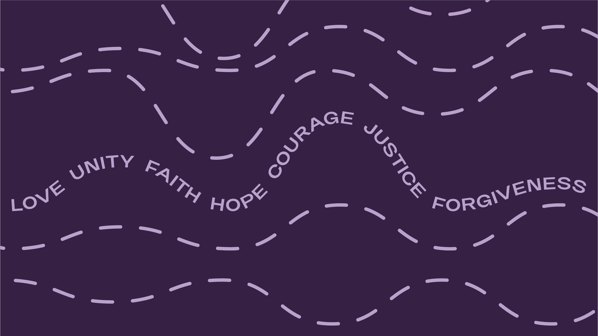
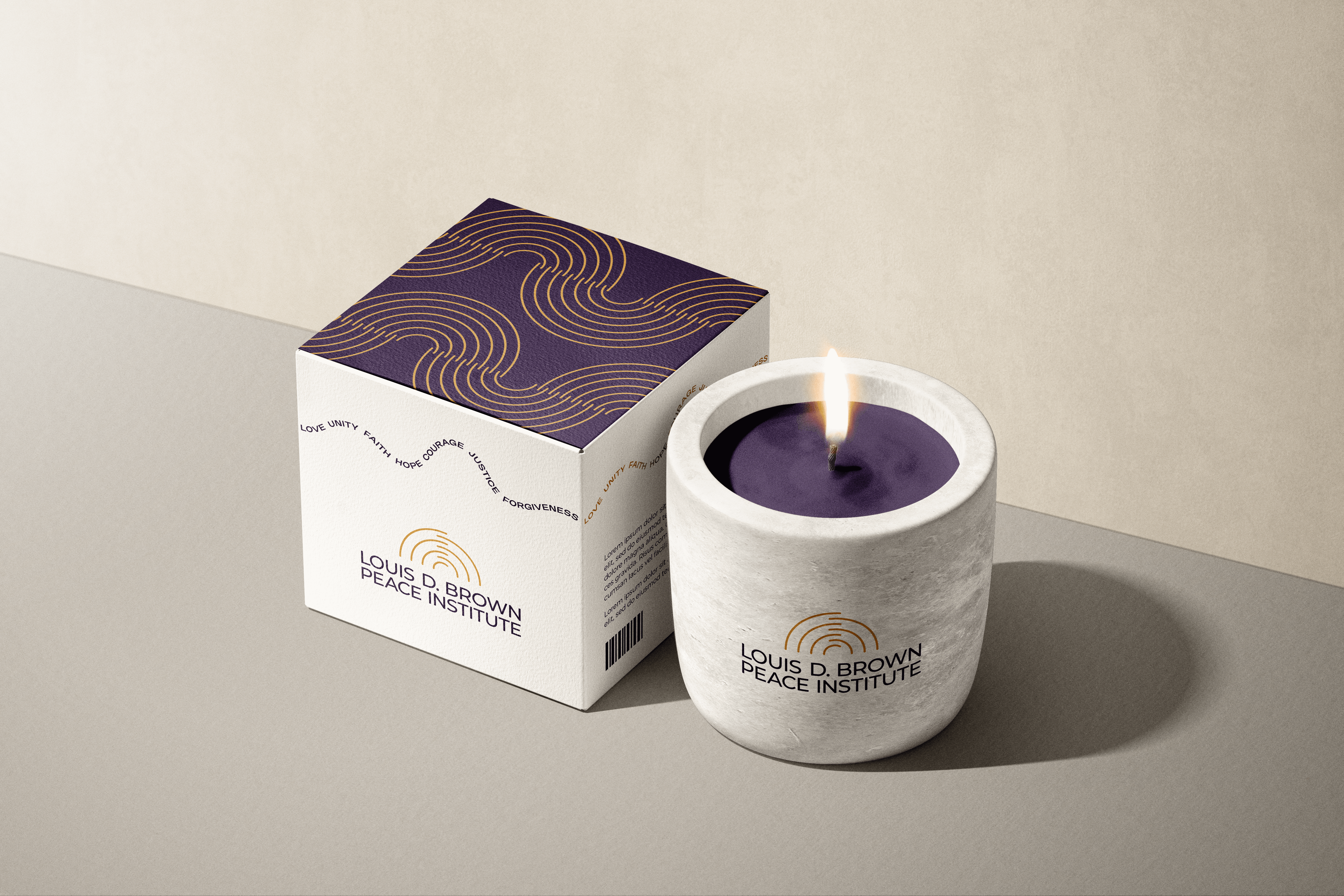
This identity represents the Institute’s brand truth: “building pathways and shaping systems of peace.” The icon features a half-circle composed of seven curved lines that intersect through one another’s negative space. These lines symbolize the Institute’s seven principles of peace—Love, Unity, Faith, Hope, Courage, Justice, and Forgiveness—highlighting their interdependence and the unified whole they create.
These seven principles also form the basis of a supporting graphic element, along with a repeated pattern that echoes the icon. A clean, minimal typeface was chosen to complement the simplicity of the symbol and ensure a timeless, versatile mark that will grow with the organization.
The color palette includes a deep purple that honors the organization’s existing visual identity, balanced with sunrise-inspired tones that suggest warmth, renewal, and hope. The result is a contemporary yet grounded identity that visually embodies the Institute’s mission and spirit.
Made in conjunction with Proverb Agency
Logo Design

Pattern Systems

Color Palette
Typography
Stationary

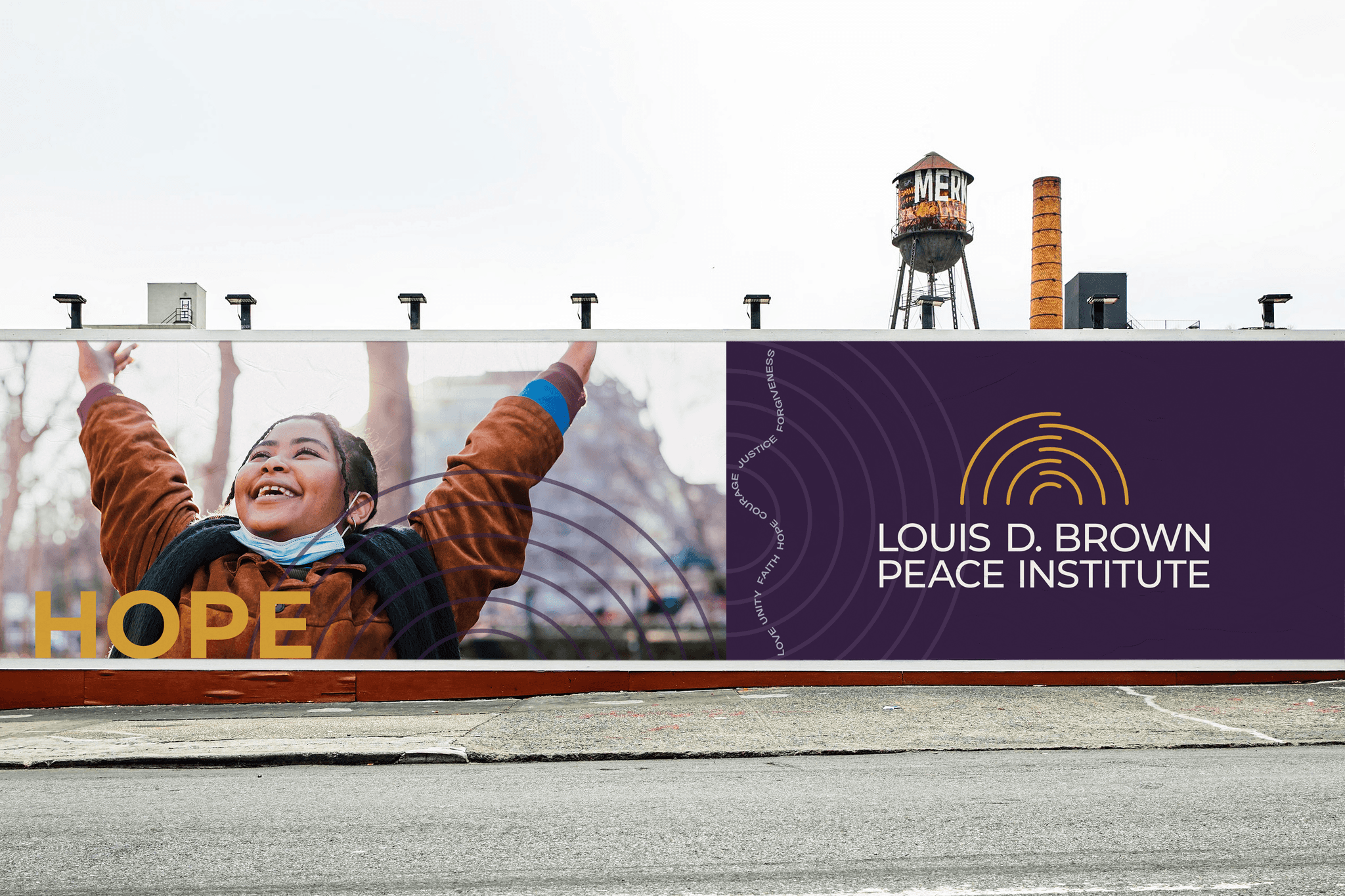
Street Billboard
Candle + Packaging
Business Card

