CAFÉ NAJJAR

Client:

Café Najjar


About:

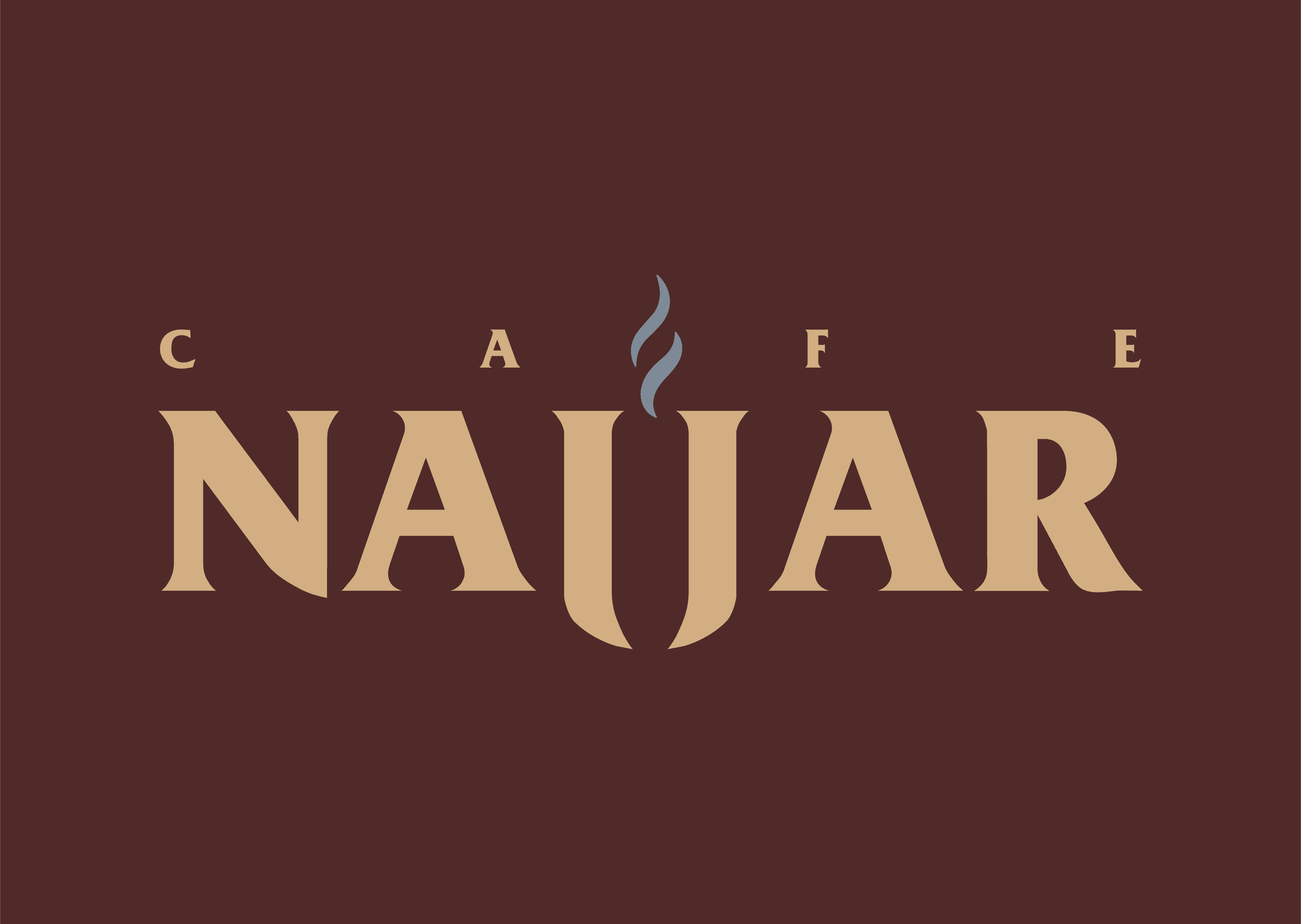
This (hypothetical) rebrand of Najjar—a heritage Lebanese coffee brand—modernizes its visual identity while staying grounded in cultural authenticity. A sleek, contemporary typeface brings clarity and confidence, balanced by design elements that honor the brand’s roots.


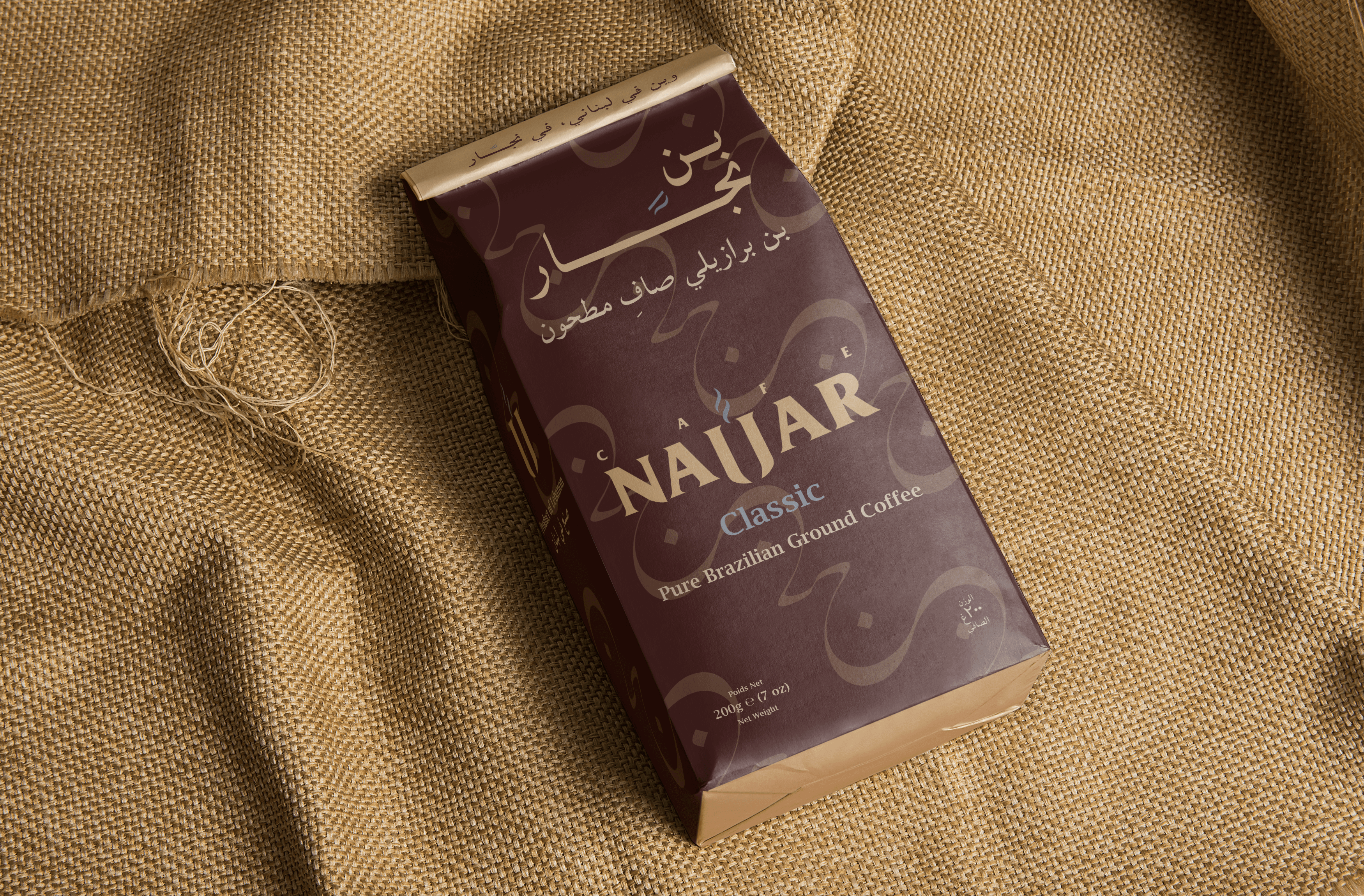
The visual identity features a repeating pattern derived from the Arabic letter “ن” (N), abstracted into flowing, smoke-like forms. It evokes the scent and warmth of freshly brewed coffee, while subtly reinforcing the brand’s name and cultural origin.


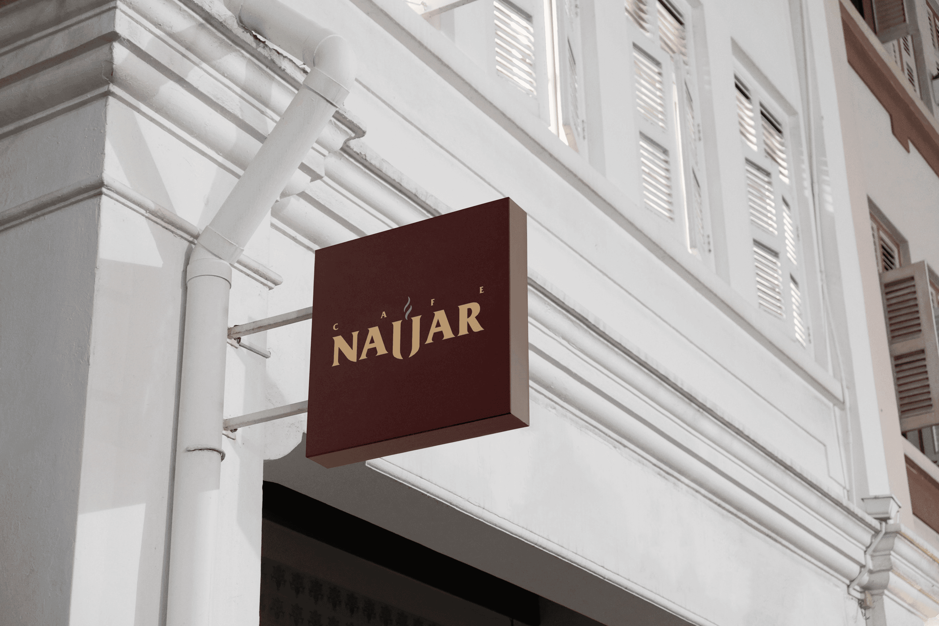
The color palette—espresso brown, toasted almond, and a touch of soft blues—captures the essence of Mediterranean coffee culture. These tones feel earthy and grounded, yet elevated, creating a sense of richness, warmth, and timeless appeal.
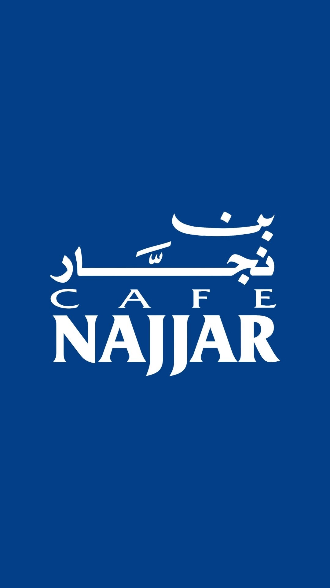
Challenge

The core challenge was how to modernize a legacy brand without losing its Lebanese identity or recognition. Café Najjar is already a well-known name, so a full rebrand wasn’t the goal—but the existing identity lacked cohesion and felt dated. The risk was making it look too sterile or disconnected from its cultural roots.

Solution

I preserved their recognizable elements—refining their original typeface and keeping their familiar blues and browns, but narrowing it to a focused palette of four ownable brand colors. I introduced a distinctive mark using the two central J’s, allowing the brand to be recognized even in abbreviated contexts. To push the identity forward, I expanded into collateral they don’t currently emphasize, like branded cups, bags, and social content—bringing tradition into a contemporary, relevant space.

Services Provided

RebrandLogo Concepting Brand Identity Social Media Stationary Out of Home

Services Provided

RebrandLogo Concepting Brand Identity Social Media Stationary Out of Home

Original Branding

Rebrand

Pattern System

Color Palette

Primary

Espresso Brown

HEX:#4a2c2a

RGB: 74, 44, 42

Primary

Espresso Brown

HEX:#4a2c2a

RGB: 74, 44, 42

Primary

Toasted Almond

HEX: #d2ae81

RGB: 210, 174, 129

Secondary

Linen

HEX: #ece2d0

RGB: 236, 226,

208

Secondary

Midnight Roast HEX: #31475e

RGB: 50, 71, 94

Secondary

Midnight Roast

HEX: #31475e

RGB: 50, 71, 94

Tertiary

Morning Azure

HEX: #7e8a97

RGB: 126, 138, 151

Tertiary

Morning Azure

HEX: #7e8a97

RGB: 126, 138, 151

Instagram Feed

Typography

Heading (English) | Friz Quadrata | Bold | All Caps

LOREM IPSUM DOLOR SIT

Heading (English) | Friz Quadrata | Bold | All Caps

LOREM IPSUM DOLOR SIT

Subheading 1 | Lucida Bright | Demibold | Sentence Case

Lorem Ipsum dolor sit

Subheading 1 | Lucida Bright | Demibold | Sentence Case

Lorem Ipsum dolor sit

Subheading 2 | Montserrat | SemiBold | Sentence Case

Lorem Ipsum dolor sit

Subheading 2 | Montserrat | SemiBold | Sentence Case

Lorem Ipsum dolor sit

Subheading 3 | Montserrat | Italic | Sentence Case

Lorem Ipsum dolor sit

Subheading 3 | Montserrat | Italic | Sentence Case

Lorem Ipsum dolor sit

Body | Montserrat | Regular | Sentence Case

Lorem Ipsum dolor sit

Body | Montserrat | Regular | Sentence Case

Lorem Ipsum dolor sit

Coffee Bag Packaging

Signage

Paper Bags