Services Provided
Designing a master-site identity is tricky; it must eventually sit alongside future residential building logos that don't even exist yet. The brand needed to be highly versatile to pair seamlessly with these upcoming sub-brands, while maintaining enough distinct personality to stand on its own without feeling generic.
I anchored the identity in a flexible typographic system rather than an illustrative icon. A custom "N" mimicking architectural beams provides a distinct, structural personality. Paired with a premium, coastal-inspired palette, this multi-lockup system acts as a sophisticated neutral that will elevate—not compete with—future building identities.
The identity is built on a bold, structural wordmark with a custom 'N' that subtly references architectural forms. This bespoke lettering suggests stability and a strong sense of place, anchoring the master-site community with a refined, permanent presence.
Designed for long-term versatility, the identity includes a secondary vertical lockup and a compact 'NLL' monogram. This flexible system ensures brand recognition across diverse platforms—allowing the master-site identity to scale from large architectural signage down to small-scale digital and print applications.
A refined coastal palette designed for longevity. Deep navy and tide blue provide structural weight, while off-white and a muted gold accent bring warmth, reflecting both the serenity and vitality of waterfront living.
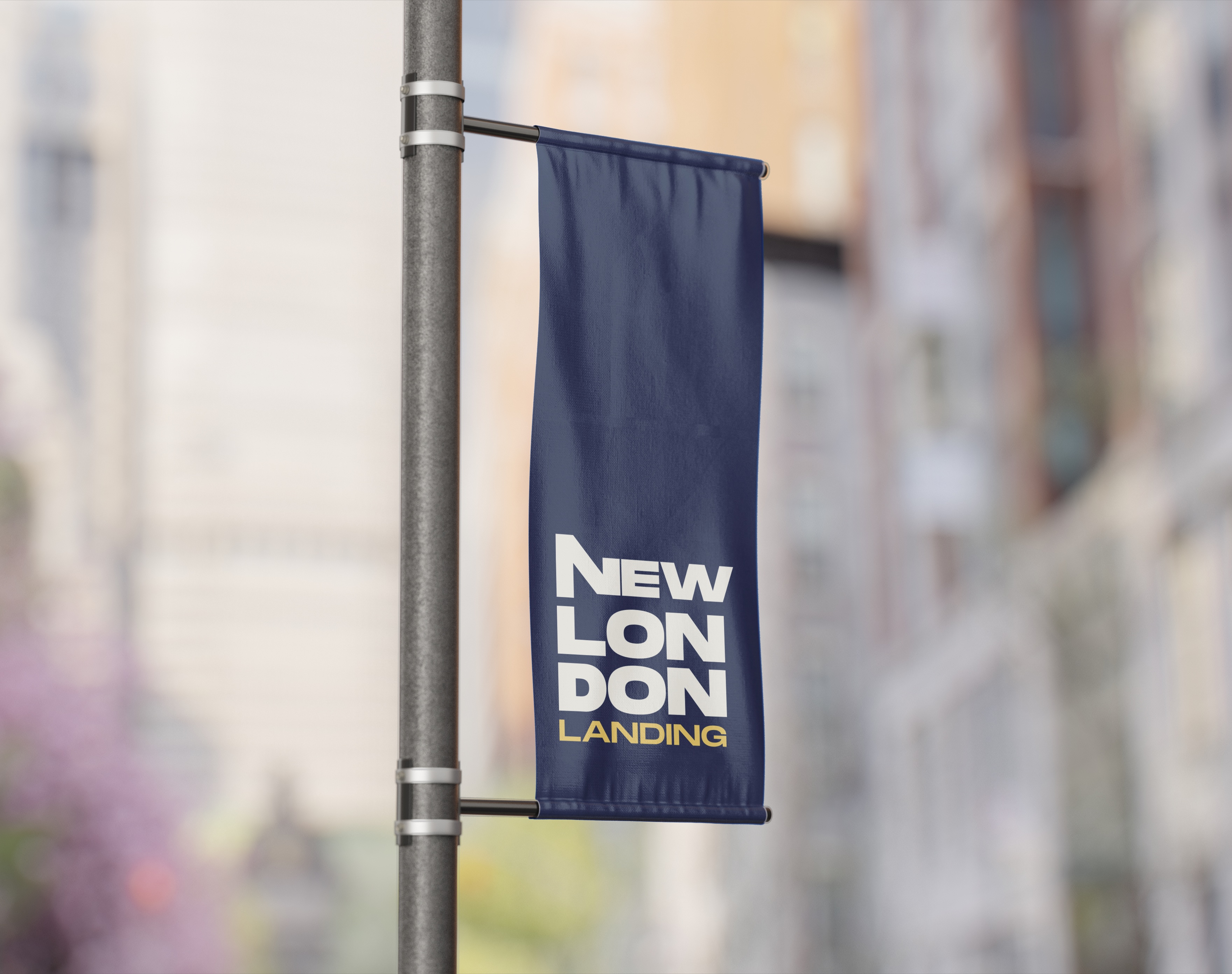
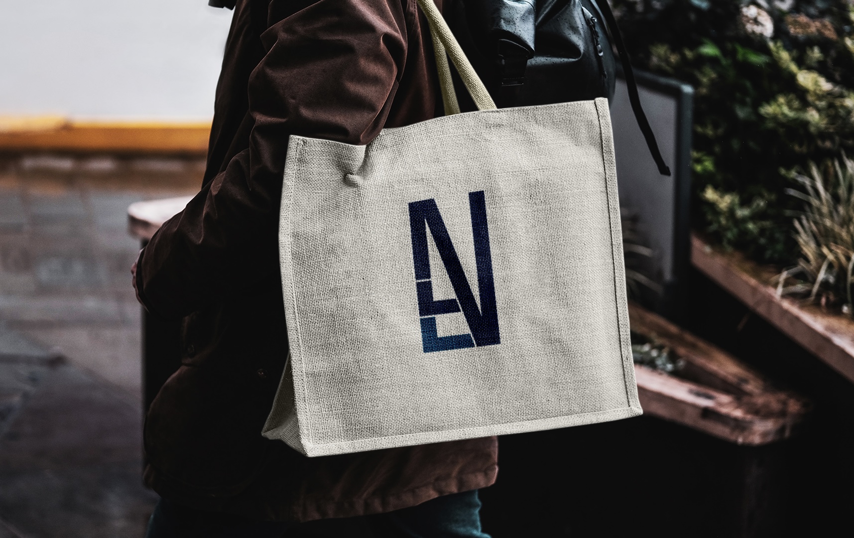
The system scales effortlessly across environmental and tactile touchpoints. The vertical wordmark maximizes legibility on commanding exterior pole banners, while the compact architectural monogram provides a refined, wearable signature on lifestyle collateral like canvas totes.