Services Provided
The client wanted a visual identity that felt stylish and artistic, appealing to a younger creative audience—without feeling grungy or overly casual. The tone had to strike a balance between edgy and elevated, capturing individuality while still feeling polished and high-end.
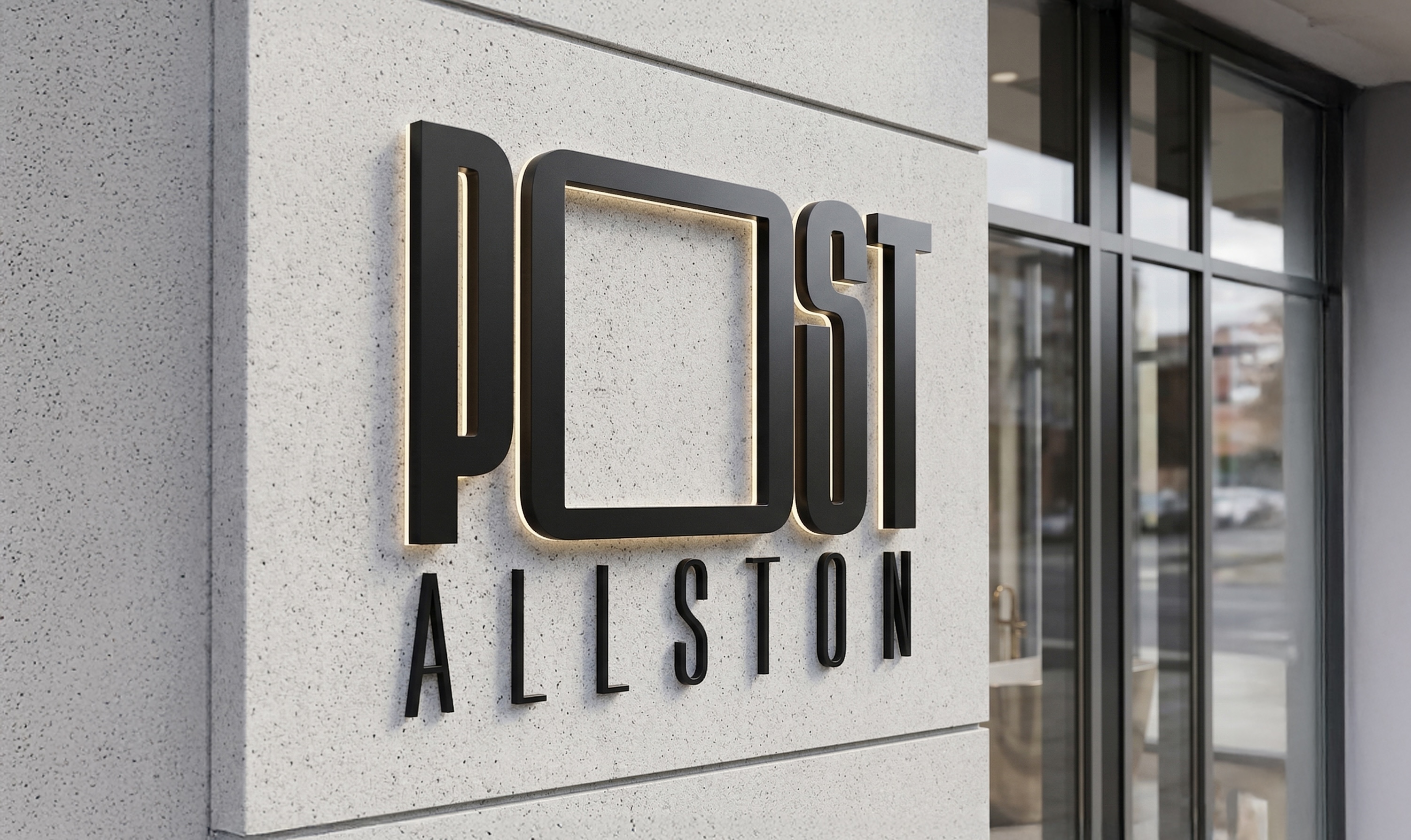
Inspired by elements from magazines and editorials, I leaned into the concept of photography and framing. That led to the use of a viewfinder as a starting point, which informed the design of the "O" in "Post." This became a flexible brand element that could expand and contract based on application, giving the identity both edge and versatility. It also served as a unique graphic tool for collateral like social media, reinforcing the brand's curated, stylish feel.
A sleek, minimalist wordmark anchors the visual language. The typography contrasts a tall, condensed sans-serif with a wide, tracked-out submark to create striking visual tension. At its core, the letter 'O' is reimagined as a flexible viewfinder—a dynamic typographic element that expands and contracts to frame the brand's world.
Inspired by high-end editorial design, the palette features deep midnight purple, cool grey, and touches of dusty lavender. These bold yet subtle tones balance warmth with an urban edge, creating a sophisticated atmosphere that feels premium without ever feeling sterile.
Designed for maximum visibility, the brand's kinetic energy is amplified on an environmental scale. Whether acting as a structural building sign or framing lifestyle photography on a massive out-of-home placement, the flexible 'O' device ensures the identity remains striking and recognizable from a distance.
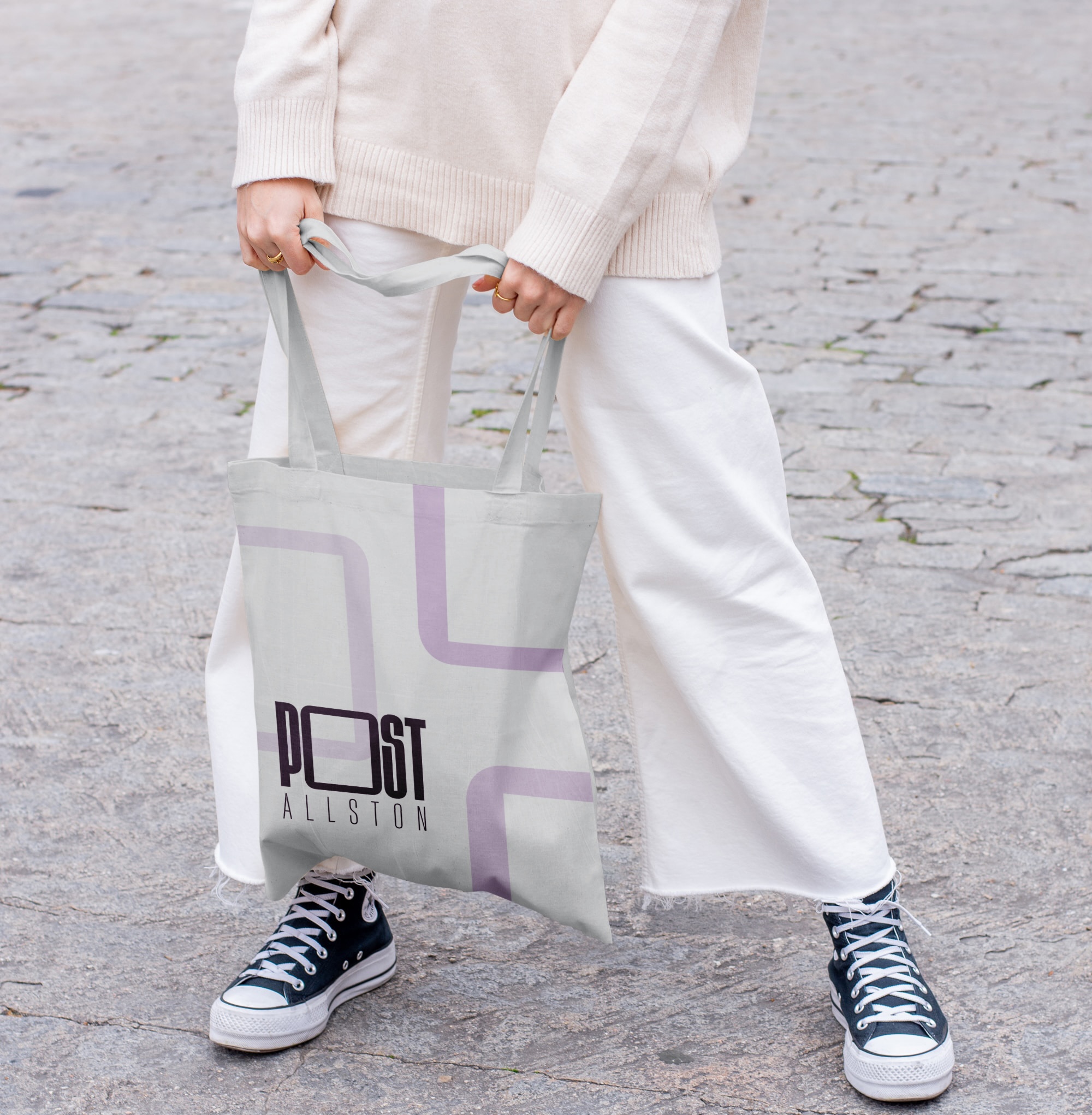
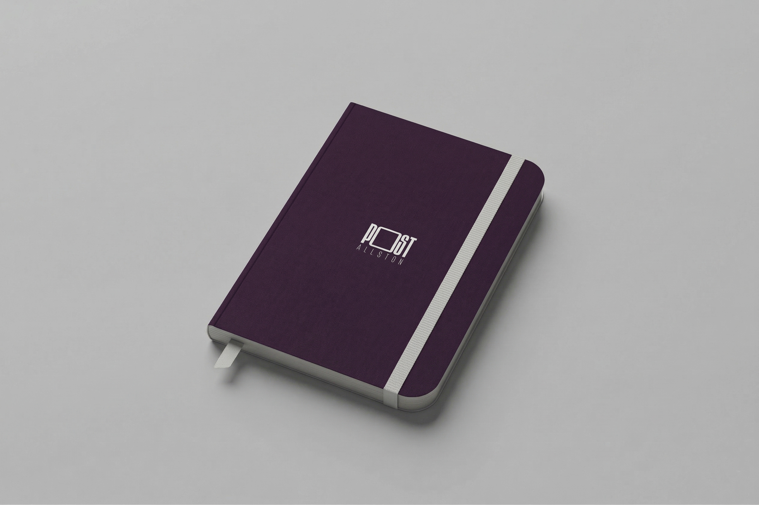
On a personal, tactile scale, the brand's energy translates seamlessly into lifestyle collateral. Everyday items like tote bags and stationery allow residents to interact with the identity directly, turning the typography into a sophisticated, wearable brand asset.